Phazes
I had the opportunity to revisit a project from six years ago: designing the logo for DJ Phazes. Initially centered around the letters "PS," the typography of the logo bore inspiration of the hip hop scene, reflective of his musical genre at the time. However, as DJ Phazes's style and tastes evolved over the years, he sought a rebranding to mirror his current artistic identity.
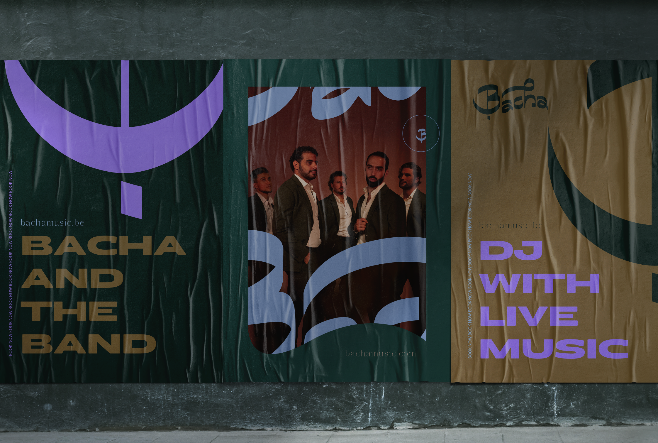
Preserving the essence of the original logo, we opted to retain its typography while expanding it to feature his full name. Crafting the letters anew, I ensured they seamlessly integrated with the existing design, preserving brand recognition. With the foundation set, our focus turned to bringing his brand to life.
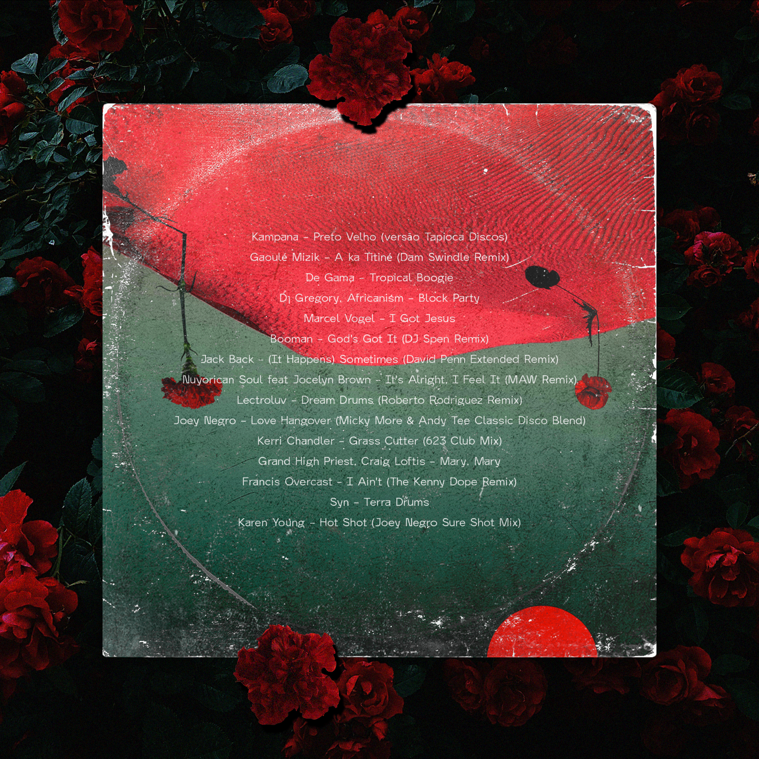
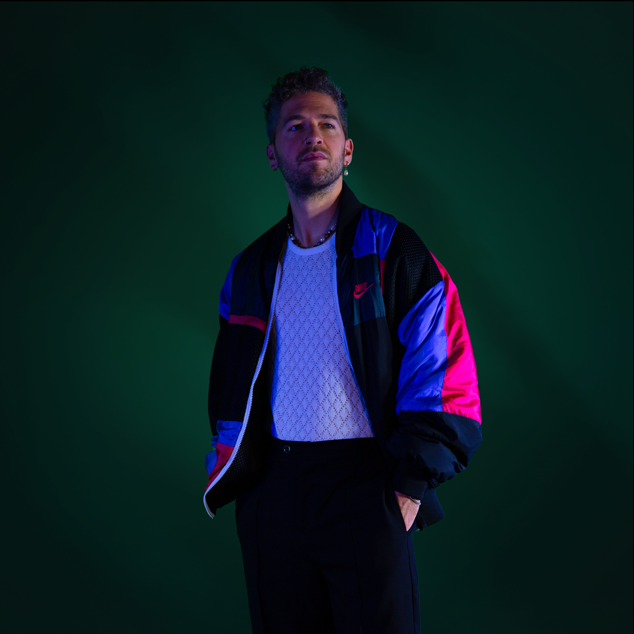
In a vibrant photoshoot, I took on the role of editor, infusing the visuals with playful, colorful surrealism— a reflection of DJ Phazes's eclectic musical palette (funk, disco & house) and dynamic personality. The result? A visual identity that not only stands out but also encapsulates his essence as an artist.


